Case Study
Project duration
December 2021
My Role
UX/UI Designer
(ideation, user research, wireframing, prototyping, testing, iteration)

The problem
The layout of the written content makes it difficult to read.
Lack of visual clues limits accessibility.
The goal
Increase user engagement by creating accessible content and simplifying the user journey.
The product
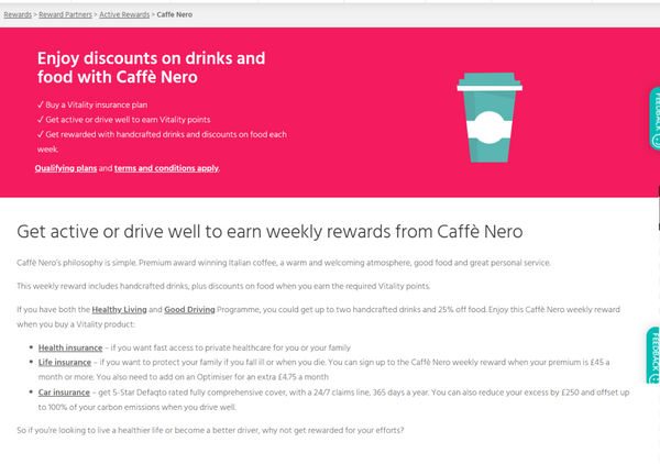
The Caffe Nero Rewards page explains one of the incentives provided by Vitality to its customers for living a healthy lifestyle.
User Research
I have run a moderated usability study with 5 users (2 females, 3 male) aged 25-72. During the study it became apparent that the large chunks of text made the younger users more likely to skip content therefore losing interest and disengaging with the website.
The study allowed to identify key user pain points and opportunities for improvement.
Key Pain Points
1
Not obvious way to join the rewards programme discouraged users from engaging with it.
2
Too much text blocked together makes it harder to digest the information.
3
The content was repetitive and not engaging.
User personas and stories
Creating user personas and mapping out the user journeys helped empathise with the users and spot improvements opportunities as well as helped implement accessibility considerations in the design.
Persona: Scott

Age: 36
Education: College
Hometown: London, UK
Family: Single
Occupation: Company Manager
Scott is a busy company manager who wants to be able to join the rewards faster as he does not have the time to search the website.
Goals:
To get rewards for safe driving
To continue his weight loss journey
to find more time to spend with his frineds
Frustrations:
It takes too long to find a way to join in
Too many choices make it difficult to make a decision
Scott, 36, is a company manager and a home owner who is very career driven. He has starter working out and joined the gyn but finds it difficult to stay motivated and create time for it. He needs some level of external motivation to stay active. He likes to socialize and use his Vitality points to get discounts on coffee and food when out and about. Additionally, one of his biggest pain points is the lack of call for action button and spend too much time on finding the right information online.
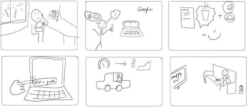
Big picture storyboard
To better uunderstand how people are going to use a product I am working on. Identifying the needs of the users through visual communications tools such as a UX storyboard can bring greater insight into what the user experience should be.

Ideation
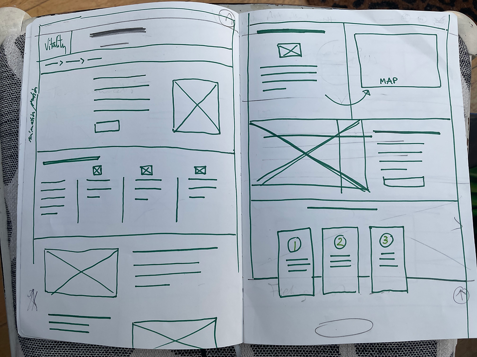
Paper wireframes
I considered various layouts to incorporate visual elements and improve the user flow.
I have then selected the design elements to include in the low-fi prototype.


Screen reader compatible navigation menu and Icons help with accessibility

Action button to help the users start their journey.
Digital wireframes
With accessibility in mind, I have added icons to the navigation menu to make it easier to locate items.
Action button to prompt users to activate the discount.
Usability study
Moderated usability studies conducted with 5 users revealed the need to make the following adjustments in the design:
Add icons to the top navigation menu
Break down text into smaller, easier to digest chuncks and include visuals
Add call for action buttons to make the Insert finding
Iteration
Testing usability with a group of users uncovered issues with the initial design. I have used the feedback gathered during the usability studies and implemented changes in to the design.
Before

After


.png)
Accessibility considerations
> Contrast - ensured AAA standard
> alt text included
> layout clear and logical with clear hierarchy
> typography - sans serif font type
> clear headings used to simplify page navigation.